Introducing Our New Ride Analytics Dashboard – See Your Performance Like Never Before!
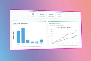
We’re excited to unveil our brand-new Ride Analytics Dashboard, a powerful tool designed to give cyclists deeper insights into their performance after every Audax event. Whether you’re a competitive rider or just love tracking your progress, this feature transforms raw ride data into interactive, easy-to-understand visualizations.
Why This Matters for Riders
After every event, participants will now get:
- Personalized Performance Breakdowns – Compare your checkpoint times, speed, and overall ranking.
- Interactive Event Analysis – Explore how the peloton performed with dynamic charts and leaderboards.
- Motivational Insights – See where you excelled and where you can improve for the next ride.
How It Works
- Post-Ride Data Upload – After each event, we process timing data from checkpoints.
- Analytics – Speed calculations get generated, time gaps, and performance categories.
- Interactive Dashboard – Riders can compare themselves to others, and even see checkpoint trends.
Who Benefits?
→ Competitive Riders – Track your progress against the fastest finishers.
→ Newcomers – Set realistic goals by seeing how others paced themselves.
→ Event Organisers – Gain insights into rider behavior to improve future routes.
Try It Out After Your Next Ride!
This tool is now live on our portal (check out here) — check it out after your next Audax event and see your ride in a whole new way.
Data-driven cycling starts here. Ride smarter, analyze better!